The Power of Color: Exploring the Psychology of Hues in Art and Design
Color is a fundamental element of art and design, evoking emotions, influencing perceptions, and communicating messages. The psychology of color delves into the profound impact of different hues on human psychology and behavior. This article delves into the power of color, exploring its psychological effects and how it is utilized in art and design to create meaningful experiences.
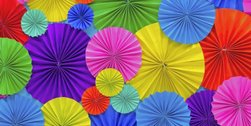
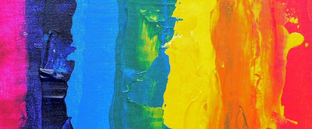
The Emotional Language of Color
Colors can evoke specific emotions and moods, tapping into our subconscious and shaping our perceptions. Here are some common emotional responses associated with different colors:
| Color | Emotional Response |
| Red | Passion, energy, excitement, and intensity |
| Blue | Calmness, serenity, trust, and stability |
| Yellow | Happiness, optimism, warmth, and creativity |
| Green | Harmony, balance, growth, and freshness |
| Purple | Royalty, luxury, creativity, and spirituality |
| Orange | Enthusiasm, vitality, warmth, and friendliness |
| Pink | Femininity, sweetness, and playfulness |
| Black | Power, elegance, sophistication, and mystery |
| White | Purity, innocence, simplicity, and clarity |
| Gray | Neutrality, balance, and practicality |
Color in Art and Design
In art and design, color is a powerful tool for creating visual impact, conveying messages, and eliciting specific responses. Here are a few ways in which color is utilized:
Branding and Identity
Color plays a crucial role in shaping the identity of brands. Companies carefully choose colors that align with their values, target audience, and brand personality. For example, red is often used to convey energy and excitement, making it a popular choice for entertainment or food industry brands. At the same time, blue signifies trust and reliability, making it common among financial institutions.
Composition and Contrast
Colors are strategically employed in compositions to create visual interest and balance. Complementary colors, opposite each other on the color wheel, are often used to achieve contrast and make elements stand out. Artists and designers experiment with color harmonies, such as analogous (adjacent colors) or triadic (equally spaced colors), to achieve a specific mood or aesthetic.
Spatial Perception and Mood
Color can influence our perception of space and impact our emotional state. Warm colors, such as red and orange, tend to make spaces feel more intimate and cozy, while cool colors, like blue and green, create a sense of openness and tranquility. Color choices in interior design, architecture, and environmental graphics can greatly influence the atmosphere and mood of a space.
In conclusion, the psychology of color reveals hues’ profound impact on our emotions, perceptions, and behavior. Understanding the emotional language of color empowers artists and designers to create impactful compositions, communicate messages, and shape experiences. Whether through branding, composition, spatial perception, or evoking specific emotions, color is a powerful tool in art and design, allowing us to tap into the deeper realms of human psychology and create meaningful connections with viewers and users.